This week, if nothing else, was a reality check for how much I’d been relying on default themes and overall system settings, and a good moment to consider the many modes of accessibility that come with presenting content online–especially with the heavy reliance on digital teaching tools this semester.
Running the WAVE checker on my personal website revealed a few fixable issues, and others that (even with an accessibility plugin) will take some more hard looking at the CSS to fix. Even then, I was surprised by a few things:
- Low-contrast and visibility issues. I’m disappointed that I didn’t think to check this earlier, and also realizing that this reliance on the default WordPress theme settings means accessibility can’t be taken for granted. Also, making hard CSS changes to the code to darken the text in question…didn’t work, because there’s still a contrast issue to fix.
- Too-long alt text: this was surprising to see flagged, as I was working from the assumption that longer and more robust description of images (when used for more than decorative purposes) might be better. There’s a lot to learn here with balance and writing very brief statements!
- Redundant links: my theme’s setting, when using a featured image, is for both the post title and the image to link both to the full post. This seems a useful setup for mobile users, where the image might provide an easier-to-click surface than the smaller text of the title, but in this case it’s creating redundancies for screen-reader users. This is also flagged in the menu, when the menu itself includes a link for the current page.
Given some of the issues inherent in the theme, it’s made me question if I want to continue using this or work on a fix. (Unfortunately, I use the same theme to manage our gallery’s website, and will definitely need to find workarounds for that page!)
Accessibility, UX, and library instruction
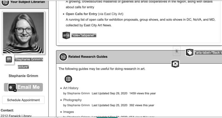
After this exercise, I also ran the WAVE report on one of my research help guides. These guides are designed to provide an overview or introduction to research sources within a given discipline or specialized topic; as such, they should (ideally) be designed to be usable to anyone at the university or accessing the university’s materials, including brand-new students, experienced faculty and researchers, and members of the public. When it comes to the “look and feel,” our settings are administered from the top-down (and thus beyond our individual control), but the system was designed to meet accessibility and readability standards when it was implemented. Additionally, a few years ago we undertook a major project in the libraries to review and edit the content of these guides (including adding alt tags and standardizing the use of bullet points, tabbed pages, and descriptive links).
What remains (and is an ongoing area of work for me and many other librarians) is the question of cognitive accessibility. Jargon is almost impossible to get away from in libraries; even our core terms like “catalog” and “database” aren’t language we can take for granted as being universally understood, but are so firmly embedded in our practice that there aren’t always viable alternatives. (If you had never used a university library before, and your instructor has simply given you instructions to “use the databases to find a peer-reviewed article on [x],” would you know what to do? 1 This means building educational elements into the guide, but that can also bring the potential for information overload. So how do you use clear language that can still encapsulate complex ideas or processes while remaining easy-to-read?
First: you realize that you can’t necessarily teach all this on your website or research guide (that’s not really what they’re designed for!). Then: you work with other librarians, you constantly review and improve your guides and language and classroom activities, you attend workshops on Universal Design and advocate for those practices across your organization. I also tend to have a basic design mantra in my head when writing, cribbed from Steve Krug:
Krug’s work2 (an excellent UX primer) addresses accessibility more directly, but that overarching, simple statement has helped me to conceptualize and rework both design and textual elements of my teaching materials, which makes technical fixes much less daunting. “Would someone who’s never seen this term before know what to do with it? Can I rewrite this link or this instruction in a way that makes it clear?”
For example, compare the language for these two links:
The first seems clear and direct…if you know what a catalog is, or why you’d want to search in one in the first place. The language of “the catalog” is partially a holdover from physical library systems, which in function and features has evolved to look more and more like search engines or databases. As an alternative, the language of the second like provides a clear action, rather than an abstract idea. You might not know everything about what’s in a library catalog, but you know, by following this link, you can search for a book. A little longer, but worth the real estate.
I feel like I keep coming back to libraries for these discussions, rather than my specific art-historical interests, but to me the work of digital history is inextricably linked with the work of digital libraries and archives— not to mention how much we can learn from the other! That said, there is a real and pressing need to talk about accessibility within the visual arts and art history, and the assumptions we make about who is reading about, writing about, and making these works.
(Also, if you want some sad perspective on this issue of web accessibility, Krug added this footnote to the 2013 edition of his text:
“When I wrote this chapter seven years ago, it ended with this: ‘Hopefully in five years I’ll be able to just remove this chapter and use the space for something else because the developer tools, browsers, screen readers, and guidelines will all have matured and will be integrated to the point where people can build accessible sites without thinking about it.'”3
Can we afford to wait another five years?)
- Fun anecdote: As an art student who relied largely on browsing and working mainly with books for research or studio projects, I used a database exactly one time as an undergraduate, and did not understand anything about their functionality or why someone would use them until I was in library school.
- Krug, Steve. Don’t Make Me Think, Revisited: a Common-Sense Approach to Web Usability, 2013 (3rd edition).
- Krug, Chapter 12: “Accessibility and you.
Jayme Kurland
“Don’t make me think.”
YES. I love this mantra for designing web-content, and really any sort of public facing content. I remember being highly frustrated in my museum work when people didn’t read labels, even when they were super short! But watching visitor behavior, and the distractions of being in a full gallery (both with people and objects), you start to see why this is the case: information overload. People get overstimulated in these contexts, and reading label text is also the last thing people are interested in doing. Making our work accessible often means paring down, and tightening up our language, our design, and our message, which isn’t a bad thing! Clear and concise is good! It doesn’t mean you, as the creator doesn’t know more, but the point isn’t to tell the viewer everything you know, it is too help them learn the basic message, and encourage curiosity to look further, if they want.
stephanie
Ahaha, the frustration with object labels is real! I’m thankful that this is something our art history faculty address directly — at least two classes that I’ve encountered have focused on writing activities for non-specialist audiences and practicing things like labels and wall text.
(Sometimes, it also seems hard because — as people who like this stuff — we WANT to tell everyone everything, or share what we’ve learned! But that’s where the ego needs to walk back, recognize that you can entice and also trust your audiences to seek more information if they need it.)
Robert Carlock
It has taken me years to fully grasp the point that you made here: not everyone understands library systems and databases. My first year of undergrad I had a class that was the closest I would get to a grad seminar until graduate school, and we used EBSCO every week to find the weekly articles, and did research in all my history and political science courses using the databases. I never struggled with it, because my HS librarian also worked at CMU and ensured that we had access to things like EBSCO and JSTOR and knew how to use them. It wasn’t until many years later that I realized how privileged I was to have this knowledge of how to search and where to search, and that many other people don’t understand how the databases work until graduate school. I think the ideas of privilege and accessibility in that sense go hand in hand, where prior knowledge can make things much more accessible in an environment with jargon.
Kathy Klingenberg
I like the fact that you use your library experience to demonstrate some of the issues we have been studying during this course. After this course, I will have a greater respect for librarians and the valuable work that they do. Also I really enjoyed your analysis of breaking down the instructions to make them more understandable. I find that writing instructions without using jargon is difficult to do. Teaching English as a Second Language made me more aware of the jargon that we use and take for granted, I remember trying to explain the terms “how about them apples?”, and “what am I, chopped liver?” I understood what it meant but it was difficult to explain to my student. Learning to speak British also increased my awareness of the assumptions that we often make when we use our language. I really hadn’t thought about people who were using screen readers to access the website. I didn’t even know what a screen reader was before this class!